Make a Statement with Type | Codrops

Selecting typefaces for a design project is about much more than just how the letters look. It is about more than serifs and sans serifs.
Font choices can have an impact on how your message is communicated and how people feel about the words on the page.
Think about the project in terms of branding. The message conveyed by typefaces should match the message of the brand or site in general. Some of the most well-known brands in the world – Coca-Cola, Canon, Fiat, IBM, Lego and MGM film studios – can be identified by their typefaces.
Is your site and idea bold? Or is it more submissive? Who do you want to feel most comfortable with your information – women, men, children? Then think about how you are using the words themselves. Are you using typography just to communicate words or more for show?
All of these factors should come into consideration when selecting fonts for your next project. It is important to understand how typography can make a statement and how you can influence through font decisions what that statement may be.
Think about the big words as text that will make a statement. Yes, the typefaces you use for main body copy are very important, but consider a user’s first impression when thinking about type and making a statement.
SET A TONE
Your font selections should reflect the meaning and tones of the words used in the typeface. Whether it is right or wrong, certain classifications of type have standard “feels.” For example, cursive fonts are often used for wedding websites or to promote things that are considered feminine. Sites that make you think of loud noises often use bold, thick typefaces.
But it can be about more than the tone of the site. Think about each word in the presentation. (How odd would it look to see the words “White Out” in purple letters or “Fist Fight” in a script?)
Determine the tone of your project before selecting the first font. Knowing your site’s intended audience is key and having an idea of how you want a project to feel will help you select appropriate typefaces.
FORMAL VS. INFORMAL
You probably know the difference between a formal and informal font on the spot.
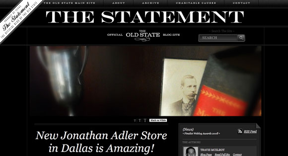
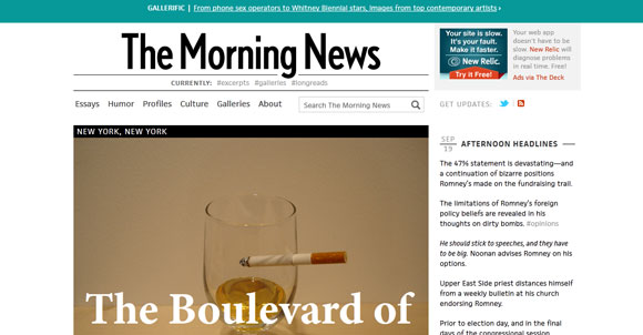
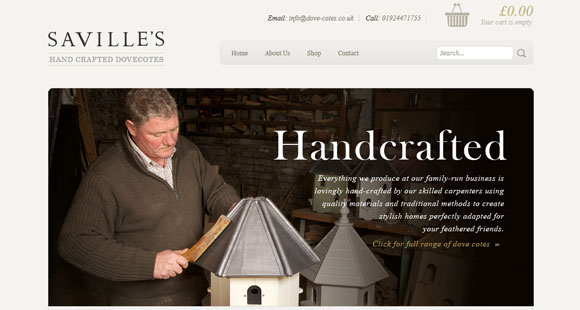
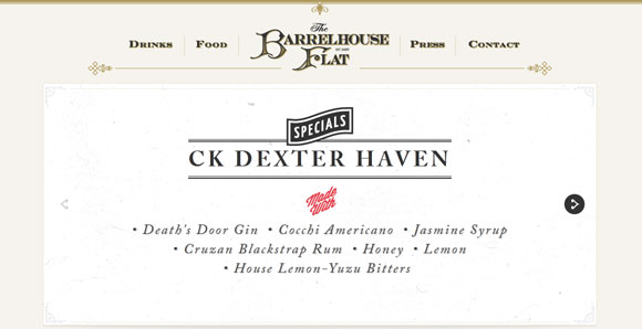
Formal typefaces tend to have traditional looks – serif and Old English styles – and are used commonly in professional publication. Books, newspapers and many websites build their design around formal typefaces. Formal type selections work well for sites that want to establish credibility and authority.
In some instances a script type style can have a formal feel, but much of it is determined by the context and font itself. Many sans serif fonts, which are standard in web design because of readability, can also be used for formal design.
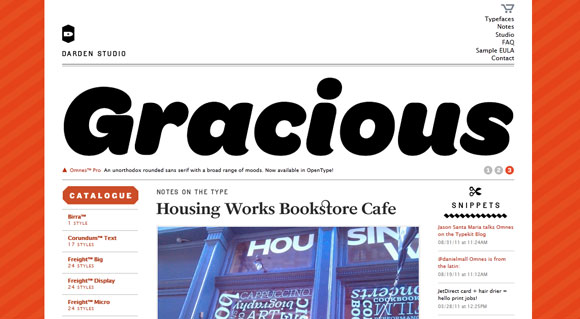
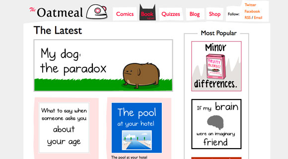
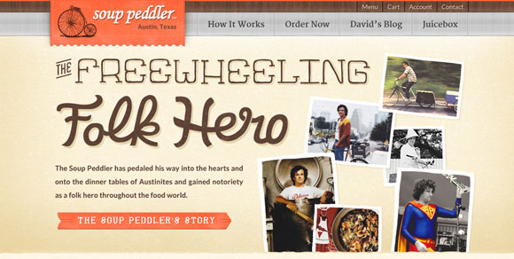
Informal typefaces have a distinct look of their own. Almost any novelty typeface would be considered informal, as would most cursive styles. Fonts that are bubbly or overly thick and round also lack a sense of formality.
These types of fonts often work great for websites that are lighthearted in nature, are designed with children or play in mind or for sites that are humorous.
MASCULINE VS. FEMININE
Really? A font can convey masculinity or femininity? Most certainly.
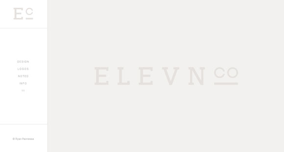
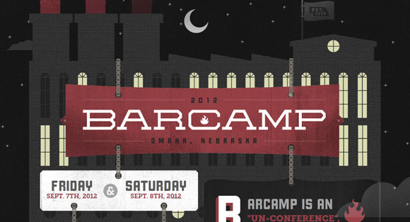
Masculine fonts tend to have hard edges, such as square or sharp serifs, and thick strokes. Slab serifs are often considered masculine but many classify a font such as Lobster (a thick-stroked script) in this category as well. Many condensed and ultra thin fonts (both serifs and sans serifs) are also considered masculine.
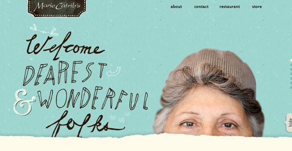
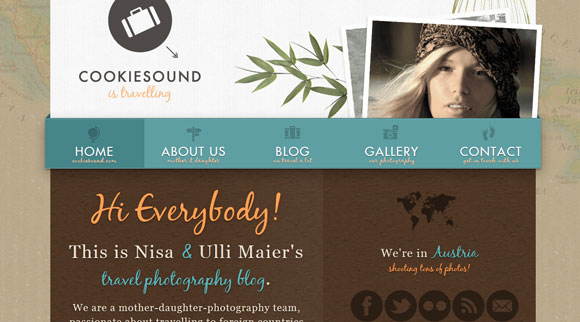
Feminine fonts are lighter, with thinner strokes and curves. Script and cursive typefaces are most commonly linked to women-targeted sites. Fonts with very round letterforms or distinct slants are also part of this classification. Finally, letters with ultra-thin strokes (think hairline) tend to have a more feminine feel.
Keep in mind though that much of what makes a font feel masculine or feminine is context. A color palette can affect how a typeface is viewed as can the actual words on the page.
GO BIG (OR SMALL) ON PURPOSE
Size matters.
Overly large fonts will catch your eye immediately (as will a few words at a super-small size).
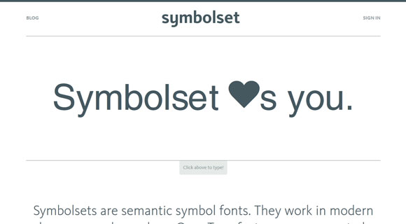
Large type emphasizes importance and heft. But text that is too large can sometimes feel overwhelming or crowded. The bigger the font size, the more the words will scream “look at me!”
Small type tends to be more formal and is used when other items in the design should be the focus. Small lettering may feel unimportant or easy to disregard. It is often used in display for secondary design elements, such as contact information.
As important as size itself is the use of varying point sizes (this also applies to bolding, italics and color). Make the important words big. Showcase words that you want to resonate with people after they read the text.
USE TYPE AS ART
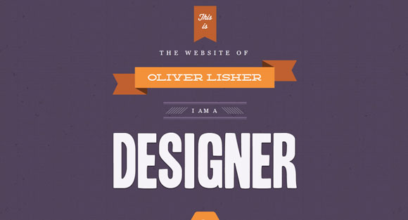
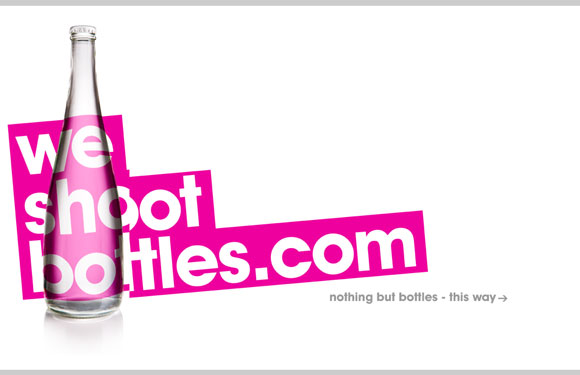
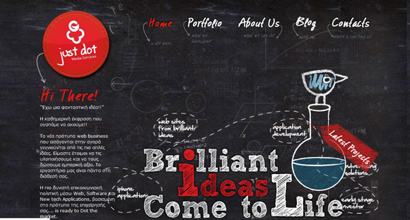
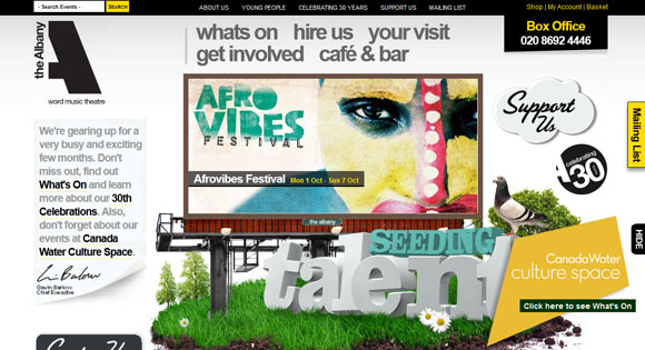
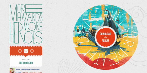
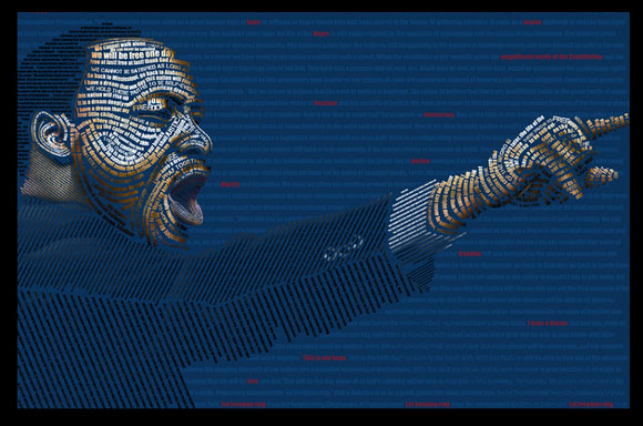
One of the easiest ways to really set your project out with type is to turn letters into a work of art.
This may be in the form of a custom typeface, a logo or even words to form some sort of image.
Using type in an unexpected way can really make elements stand out. But it can also be a risky tactic. Be careful to make sure that your text actually works as an image and that the words remain readable. This is a trick that is best employed sparingly and for a limited number of elements.
FOOD FOR THOUGHT
Think about common “brands” and their signature typefaces. Would you view these sites differently if tomorrow the fonts changed?
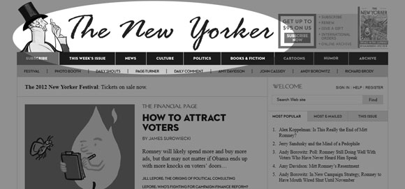
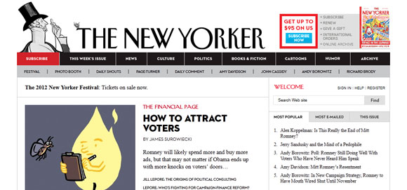
The New Yorker: The font selection is formal and carries authority. Switching to a lighthearted, informal style hurts the legitimacy of the title.
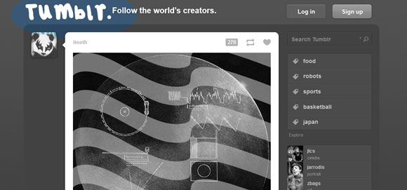
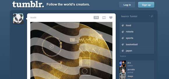
Tumblr.: The popular site uses a font that is strong and traditional. The more sketchy, handwritten style seems to have a disconnect with the brand.
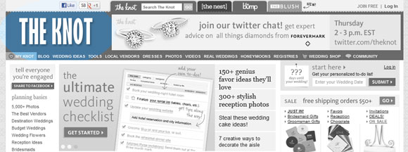
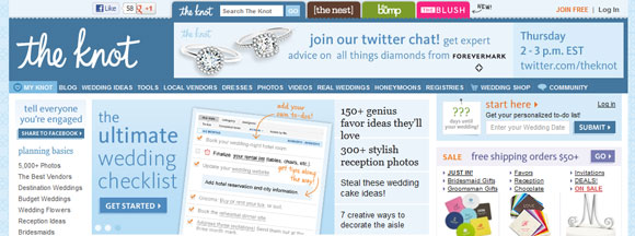
The Knot: The popular wedding planning and information site uses a font with a distinct feminine feel. Would fewer women turn to the site if it used a stronger typeface?
