CSS Button Switches with Checkboxes and CSS3 Fanciness | Codrops
Hello everyone! For a while now, I’m having fun with the new CSS properties (CSS3). It’s an incredible playground for creativity and cleverness. I particularly enjoy designing and creating UI elements like buttons, switches, toggles and such. That’s the focus of this tutorial, I’ll show you how to create button switches with CSS only, without a line of JavaScript. Ready for it?
A few things before starting:
- You won’t see any vendor prefixes in the CSS snippets, but you will of course find them in the files.
- We won’t use much transitions between states because we often use pseudo-elements to reduce the number of elements to its minimum, and as of writing, only Firefox supports transitions/animations on pseudo-elements.
- We’ll use the “checkbox hack” (see below).
- I personally use the box-model where [width] = [element-width] + [padding] + [borders]. I activate it with the following snippet:
*,*:after,*:before { box-sizing: border-box;}ABOUT THE “CHECKBOX HACK”
The checkbox hack allows us to have a toggle handler in pure CSS. It relies on a checkbox (which is either checked or unchecked), the :checked pseudo-selector, and a sibling selector (~ or +). Basically, you can say “if the checkbox is checked, then the following X element is behaving like this”.
The old way consisted of having a checkbox with an ID, and a label tag with a “for” attribute calling the checkbox ID. This technique allowed to hide the checkbox and still toggle it by clicking on the label. The only problem with this approach it that mobile Safari doesn’t support it.
So we have a workaround for that: turn the checkbox invisible with the opacity property, set it on top of whatever element you want (I still use label) and there you go, when clicking the element, you are actually clicking the checkbox! The code looks like this:
.switch input { /* First, we make it as wide as the container */ position: absolute; width: 100%; height: 100%; /* Then, we put it on top of everything else */ z-index: 100; /* Last, we make it invisible */ opacity: 0; /* This one is just for ergonomy */ cursor: pointer;}Those 12 lines of CSS will be used in all the following demos, so feel free to copy paste it; it never changes.
Note: for another awesome demo including the checkbox hack, you may want to have a look at this tutorial: Annotation overlay effect with CSS3.
EXAMPLE 1
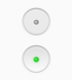
Let’s start with a lovely little push button, with a small illuminated LED when it’s on.
The Markup
<div class="switch"> <input type="checkbox"> <label></label></div> The .switch element is our container. Within this very element the checkbox and the label will be positioned on top of each other to allow us to do the magic trick.
The input doesn’t need anything more than the checkbox type (no ID, no name, nothing).
And the last element could be anything (an anchor, a div, a span, a label, a bold/italic tag, whatever). I personally chose a label because I used to use the old checkbox hack, which required a label.
The CSS
First, we give our button a size by setting the width and height to the container. Be sure the width and the height are the same, or your button won’t be round. Remember to hide the checkbox with the according CSS code at the top of this article.
.switch { width: 100px; height: 100px; position: relative;}Then, the label, which is where we’ll add all the styling to. First of all, we set it to block and make it 100% of its parent size (the container). Then, we give it a relative position in order to add some pseudo-elements later.
Time for some real styles: a background color, a round shape, and some awesome box-shadows to make it look like it’s embossed.
.switch label { display: block; width: 100%; height: 100%; position: relative; border-radius: 50%; background: #eaeaea; box-shadow: 0 3px 5px rgba(0,0,0,0.25), inset 0 1px 0 rgba(255,255,255,0.3), inset 0 -5px 5px rgba(100,100,100,0.1), inset 0 5px 5px rgba(255,255,255,0.3);}It already looks acceptable, but we need to add some pseudo-elements to make it awesome, right? So let’s go.
The first one is meant to improve the embossed look by adding a little recess around the button. So we set it to position absolute, behind the button and we don’t give it any size but we give it some top/right/bottom/left values instead.
And of course, some aesthetics: a soft gradient from top to bottom and some sexy box-shadows.
.switch label:after { content: ""; position: absolute; z-index: -1; top: -8%; right: -8%; bottom: -8%; left: -8%; border-radius: inherit; background: #ddd; /* Fallback */ background: linear-gradient(#ccc, #fff); box-shadow: inset 0 2px 1px rgba(0,0,0,0.15), 0 2px 5px rgba(200,200,200,0.1);}And now, the LED, which is the main indicator for the state of the button. Basically, it’s a small circle placed in the middle of the button. A little more fanciness than *just* box-shadows will be used here: a radial gradient. Let’s use a simple one though, just to make the whole thing a little nicer for browsers supporting radial gradients, and make a fallback for others.
.switch label:before { content: ""; position: absolute; width: 20%; height: 20%; left: 40%; top: 40%; border-radius: inherit; background: #969696; /* Fallback */ background: radial-gradient(40% 35%, #ccc, #969696 60%); box-shadow: inset 0 2px 4px 1px rgba(0,0,0,0.3), 0 1px 0 rgba(255,255,255,1), inset 0 1px 0 white;}Okay, so now, we have a nice button. Let’s deal with the checked state. When you click on the container, you actually click on the invisible checkbox which sits on top of the label. From here, you have activated the checkbox, meaning you can use the :checked state and a sibling selector. The following is like saying “Hey, the input element is checked, so the following label in the .switch element has to be like this.
So when the button is turned on, we change the background color of the LED (:before pseudo-element), as well as the background of the button. That’s basically it!
.switch input:checked ~ label { /* Button */ background: #e5e5e5; /* Fallback */ background: linear-gradient(#dedede, #fdfdfd);}.switch input:checked ~ label:before { /* LED */ background: #25d025; /* Fallback */ background: radial-gradient(40% 35%, #5aef5a, #25d025 60%); box-shadow: inset 0 3px 5px 1px rgba(0,0,0,0.1), 0 1px 0 rgba(255,255,255,0.4), 0 0 10px 2px rgba(0, 210, 0, 0.5);}EXAMPLE 2
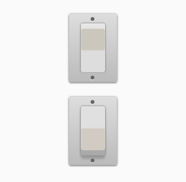
In this example we want to come close to an actual light button switch, so let’s see how far we can take it.
The Markup
The markup is the same as in the first example; a container, a checkbox and a label:
<div class="switch"> <input type="checkbox"> <label></label></div> The CSS
We start by setting a size to our button and hiding the checkbox.
.switch { width: 50px; height: 100px; position: relative;}This example requires many more box-shadows to look well. Let’s not forget to add a soft background color and rounded corners, to make the whole thing look even softer:
.switch label { display: block; width: 100%; height: 100%; position: relative; background: #cbc7bc; border-radius: 5px; box-shadow: inset 0 1px 0 white, 0 0 0 1px #999, 0 0 5px 1px rgba(0,0,0,0.2), 0 2px 0 rgba(255,255,255,0.6), inset 0 10px 1px #e5e5e5, inset 0 11px 0 rgba(255,255,255,0.5), inset 0 -45px 3px #ddd;}And now, let’s add some pseudo-elements. The first one is meant to create the housing, the second one to simulate screws. Let’s start with the housing. It’s pretty much the same thing as in our previous example, plus a little border:
.switch label:after { content: ""; position: absolute; z-index: -1; top: -20px; left: -25px; bottom: -20px; right: -25px; background: #ccc; /* Fallback */ background: linear-gradient(#ddd, #bbb); border-radius: inherit; border: 1px solid #bbb; box-shadow: 0 0 5px 1px rgba(0,0,0,0.15), 0 3px 3px rgba(0,0,0,0.3), inset 0 1px 0 rgba(255,255,255,0.5);}The second one is more interesting, since we only have one element to create two screws. This is one more job for box-shadows! Because we are using a plain color, we can easily make a shadow look like our main element. We could even make 4, 10 or 42 screw holes with this. But we just need two here:
.switch label:before { content: ""; position: absolute; width: 8px; height: 8px; top: -13px; left: 20px; background: #666; border-radius: 50%; box-shadow: 0 1px 0 white, /* Subtle reflection on the bottom of the hole */ 0 120px 0 #666, /* Faking a second screw hole... */ 0 121px 0 white; /* And its reflection */}Now the part of the checked state. In this example only the central part (which is the label) will change when we click it. And we created this material effect only with box-shadows, so easy peasy, let’s just revert them, adapt them, prettify them, and we’re done:
.switch input:checked ~ label { /* Button */ background: #d2cbc3; box-shadow: inset 0 1px 0 white, 0 0 0 1px #999, 0 0 5px 1px rgba(0,0,0,0.2), inset 0 -10px 0 #aaa, 0 2px 0 rgba(255,255,255,0.1), inset 0 45px 3px #e0e0E0, 0 8px 6px rgba(0,0,0,0.18);}EXAMPLE 3
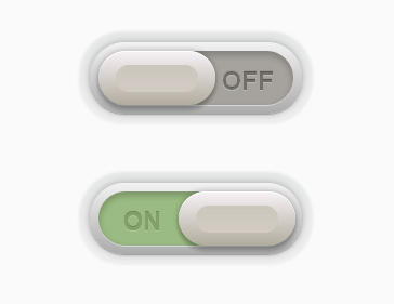
Let’s get on with something even cooler. This one is adapted from a lovely design by talented Piotr Kwiatkowski. It looks so smooth, doesn’t it?
The Markup
For this switch, we will need an extra element. Let’s pick something quiet and discrete, like an <i>.
<div class="switch"> <input type="checkbox"> <label><i></i></label></div> The CSS
So once again, we hide the checkbox, with the same little snippet of CSS. And, as always, we give a size to the container.
.switch { width: 180px; height: 50px; position: relative;}So here we are going to do the following: the label will be the container of the toggle switch. The <i> tag will be the actual toggle element. So the label is only the dark grey background with shadows, nothing more. Pseudo-elements will do the rest.
.switch label { display: block; width: 100%; height: 100%; position: relative; background: #a5a39d; border-radius: 40px; box-shadow: inset 0 3px 8px 1px rgba(0,0,0,0.2), 0 1px 0 rgba(255,255,255,0.5);}This is the “frame of the container”, so we give it a nice gradient, and some sweet box-shadows.
.switch label:after { content: ""; position: absolute; z-index: -1; top: -8px; right: -8px; bottom: -8px; left: -8px; border-radius: inherit; background: #ccc; /* Fallback */ background: linear-gradient(#f2f2f2, #ababab); box-shadow: 0 0 10px rgba(0,0,0,0.3), 0 1px 1px rgba(0,0,0,0.25);}This pseudo-element is meant to create a soft hollow around the button, so as usual, we’ll use gradient and shadows. A little enhancement for Chrome with the use of a blur filter to make the effect even softer.
.switch label:before { content: ""; position: absolute; z-index: -1; top: -18px; right: -18px; bottom: -18px; left: -18px; border-radius: inherit; background: #eee; /* Fallback */ background: linear-gradient(#e5e7e6, #eee); box-shadow: 0 1px 0 rgba(255,255,255,0.5); -webkit-filter: blur(1px); /* Smooth trick */ filter: blur(1px); /* Future-proof */}So now, we have a really beautiful frame for our toggle switch. Let’s take care of the switch, shall we?
We turn it into a block element, give it the height of its parent and a little bit more than half of its width. We place it on the left of the container, and give it some nice styles (shadows and gradients, you get it):
.switch label i { display: block; height: 100%; width: 60%; position: absolute; left: 0; top: 0; z-index: 2; border-radius: inherit; background: #b2ac9e; /* Fallback */ background: linear-gradient(#f7f2f6, #b2ac9e); box-shadow: inset 0 1px 0 white, 0 0 8px rgba(0,0,0,0.3), 0 5px 5px rgba(0,0,0,0.2);}This first pseudo-element is used to enhance the aesthetics: it adds a curved effect to the toggle. We place it in the middle, and gave it a gradient from top to bottom, almost the same as the one of its parent but reverted.
.switch label i:after { content: ""; position: absolute; left: 15%; top: 25%; width: 70%; height: 50%; background: #d2cbc3; /* Fallback */ background: linear-gradient(#cbc7bc, #d2cbc3); border-radius: inherit;}The second pseudo-element is the word “ON” or “OFF”, depending on the state of the button. We use the content property to set the right word, and some font styles to make it look like it’s engraved in the background:
.switch label i:before { content: "off"; position: absolute; top: 50%; right: -50%; margin-top: -12px; color: #666; /* Fallback */ color: rgba(0,0,0,0.4); font-style: normal; font-weight: bold; font-family: Helvetica, Arial, sans-serif; font-size: 24px; text-transform: uppercase; text-shadow: 0 1px 0 #bcb8ae, 0 -1px 0 #97958e;}So now we have a toggle switch which looks like the one from Piotr, right? Let’s get into the checked state. Three things are changing when we click on the checkbox: the background color, the toggle’s position, and the word (“ON” or “OFF”):
.switch input:checked ~ label { /* Background */ background: #9abb82;}.switch input:checked ~ label i { /* Toggle */ left: auto; right: -1%;}.switch input:checked ~ label i:before { /* On/off */ content: "on"; right: 115%; color: #82a06a; text-shadow: 0 1px 0 #afcb9b, 0 -1px 0 #6b8659;}EXAMPLE 4
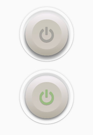
Our last example is based on another work from Piotr Kwiatkowski, but slightly edited by myself in order to have the same color theme as the others.
Let’s do something really amazing on this one, with an icon font and transitions!
The Markup
The markup will be pretty much the same as in the third example. The class on the <i> tag is required in order to makeFontAwesome work.
<div class="switch"> <input type="checkbox"> <label><i class="icon-off"></i></label></div> The CSS
I won’t cover here all the FontAwesome stuff because I’m pretty sure it has already been covered in another article, plus probably all of you have already done that before. Just make sure that
- your @font-face stuff indicate the correct paths to the files,
- one of your CSS files includes FontAwesome related styles.
So let’s start with the basics: checkbox hiding and container sizing:
.switch { width: 150px; height: 150px; position: relative;}Now, let’s take care of the label which is basically our big old button. Note that we include a few font style here. Since all of them are inherited, they will go straight to the <i> element (icon). So nothing new, a sweet gradient and some box-shadows for a beautiful effect:
.switch label { display: block; width: 100%; height: 100%; position: relative; color: #a5a39d; font-size: 70px; text-align: center; line-height: 115px; text-shadow: 0 2px 1px rgba(0,0,0,0.25); border-radius: 50%; background: #b25244; /* Fallback */ background: linear-gradient(#f7f2f6, #b2ac9e); transition: all 0.3s ease-out; z-index: -1; box-shadow: inset 0 2px 3px rgba(255,255,255,0.13), 0 5px 8px rgba(0,0,0,0.3), 0 10px 10px 4px rgba(0,0,0,0.3);}Now, both label pseudo-elements are used to make the material effect around the button. We apply the blur filter to the closest one to make it a bit more subtle.
.switch label:before { content: ""; position: absolute; left: -10px; right: -10px; top: -10px; bottom: -10px; z-index: -1; border-radius: inherit; box-shadow: inset 0 10px 10px rgba(0,0,0,0.13); -webkit-filter:blur(1px); /* Smooth trick */ filter: blur(1px); /* Future-proof */}.switch label:after { content: ""; position: absolute; left: -20px; right: -20px; top: -20px; bottom: -20px; z-index: -2; border-radius: inherit; box-shadow: inset 0 1px 0 rgba(255,255,255,0.1), 0 1px 2px rgba(0,0,0,0.3), 0 0 10px rgba(0,0,0,0.15);}Okay, let’s deal with our extra element: <i>. FontAwesome uses the :before pseudo-element to show the icon, so we can’t use it. But, we can use the :after one, and we will because we need something to make the upper part of our button.
As usual, we give it a nice gradient, some subtle shadows, and a 1px blur to make it smoother.
.switch .icon-off:after { content: ""; display: block; position: absolute; width: 70%; height: 70%; left: 50%; top: 50%; z-index: -1; margin: -35% 0 0 -35%; border-radius: 50%; background: #d2cbc3; /* Fallback */ background: linear-gradient(#cbc7bc, #d2cbc3); box-shadow: 0 -2px 5px rgba(255,255,255,0.05), 0 2px 5px rgba(255,255,255,0.1); -webkit-filter:blur(1px); /* Smooth trick */ filter: blur(1px); /* Future-proof */}And now, the checked state; pretty simple: the icon turns green, and the button looks pressed:
.switch input:checked ~ label { /* Button */ color: #9abb82; box-shadow: inset 0 2px 3px rgba(255,255,255,0.13), 0 5px 8px rgba(0,0,0,0.35), 0 3px 10px 4px rgba(0,0,0,0.2);} FINAL WORDS
So finally, what do we need to make beautiful buttons with pure CSS? Mostly shadows! But subtle gradients and rounded corners help a lot, too. To turn a simple button into a button switch, we just need one more thing: a checkbox.
Please, keep in mind that this kind of stuff is pretty tricky, so not every browser will display it correctly. But, you can make the whole thing fall back to a simple checkbox very easily by using a filtering selector, for example:
.switch:not(:checked) label { /* Styles for label go here... */ } .switch:not(:checked) input { /* Styles for input go here... */ }In this case, :not(:checked) is a filter so that browsers that don’t support :checked don’t follow these rules. Check out this article by Lea Verou to find out more about this technique: Accessible star rating widget with pure CSS
Anyway, with a little more time, we can make beautiful things like these:
- A realistic button switch (Inspired by Diego Monzon’s work)
- A light button switch (Inspired by Mike Ackerman’s work)
- A conceptual yes/no switch (Inspired by Nina Georgieva’s work)
Thank you for reading this tutorial, and if you have any question or related work to show, please do. 🙂


