Creative Background Styles and Trends in Web Design | Codrops

It is sometimes the least noticed part of your website design. Other times it can be attention-grabbing. Mostly, though, the background sets the tone and provides context for the information on your site.
Backgrounds can come from a lot of things and are wide-ranging in scope. You can use images, patterns, solid colors or some combination of them all.
Today we are going to look at different types of backgrounds that are used well and explore why they work.
WHAT MAKES A GOOD BACKGROUND?
There is no set rule for what type of background will work best for your website but there are some common factors.
- The content should have purpose.
- The background should fall in line with your brand.
- It should allow for placement of text that is easy to read. (This applies to color, contrast and size.)
- The background theme should be fairly consistent throughout the site. (You don’t want visitors to think they have stumbled on to another page when clicking through.)
- Backgrounds should download quickly and not cause the site to slow down or lag.
WHAT’S TRENDING?
Just as clothes and hairstyles change, so do web design trends. This is especially true of backgrounds.
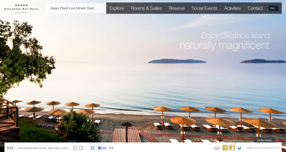
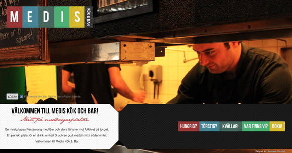
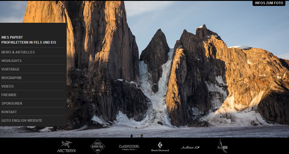
Right now, many sites are featuring large images on their opening page and above the scroll. While some images are sharp and easy to understand – think photos or illustrations, some are much harder to decipher. Large, blurry or faded images are appearing everywhere.
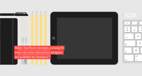
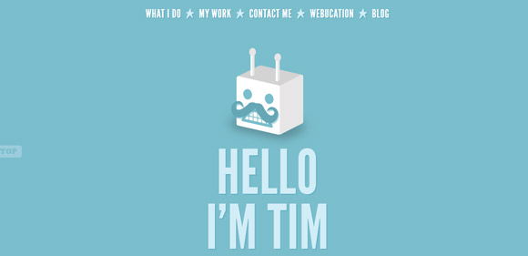
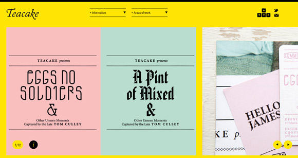
Solid backgrounds are also popular. But not with just your common black and white (a classic that never goes out of fashion), many designers are using bold, striking colors to help elements pop off the background.
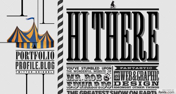
Finally, patterns and texture are showing well. But the size of the shapes seems to have changed recently. There are more and more sites using a large pattern in the background, contrasting with the tiny patterns that were popular a while ago. Patterns, although large, feature low-contrast items for a rather subtle feel. Subtly textured backgrounds are also a very popular choice for giving a realistic feel to the design.
SHARP IMAGES
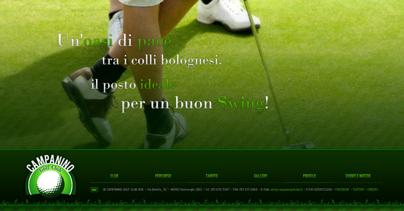
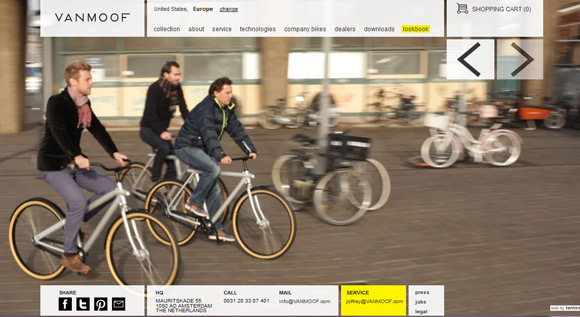
Using strong, sharp images never really goes out of style but what is trending is how they are used. More of these images are popping up as backgrounds, rather than as photos on another background. Opt for striking colors or great faces, much like the Rory McIlroy site.
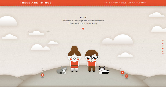
Illustrations are also gaining popularity. Again, color is important as is the quality of the illustration.
BLURRY OR FADED IMAGES
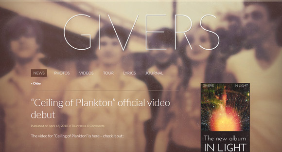
Using blurry or faded images can be rather tricky. It only works if you have a strong image to start with. (Using a poor quality image here will be messy.)
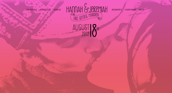
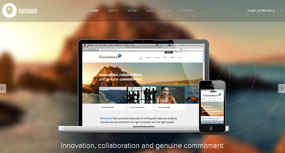
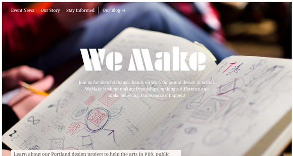
Blur or fade the image yourself with a distinct purpose in mind. Sometimes a dramatic fade, like the muted mountain used by Humaan, works beautifully while other times just a slight blur is enough (“We Make” sketchXchange).
SOLID COLOR
Bright colors are in and they are attention-getting. Most designers are opting for simplicity when using color to create depth and contrast. (The lime green and black and white combo employed by mediumrare is exceptionally striking.)
WHITE OR BLACK
White and black backgrounds are classic and easy to use. You can create contrast for type (even small type) easily and will always be in fashion.
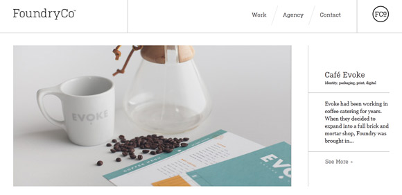
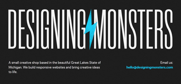
Make a white or black background look even more modern with a hint of dimension. Foundry Co. uses lines to create added emphasis while Designing Monsters uses a splash of color against the darkest hue.
PATTERNS AND TEXTURES
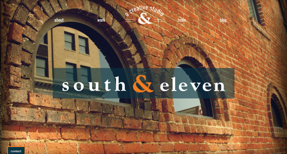
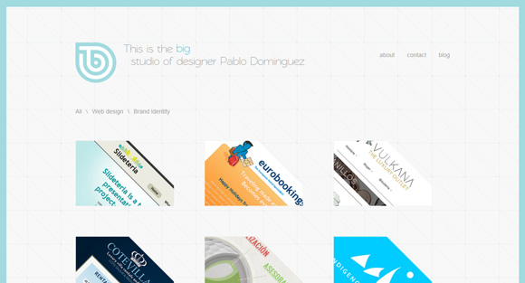
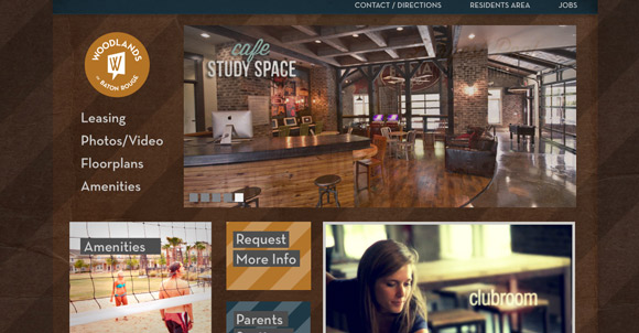
Don’t be afraid to go bold with patterned backgrounds. Big, repeating prints are all over the places these days. Subtle textures can add some realism to your design.
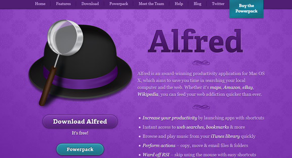
The key to this modern design is moderate contrast. Note the subtle difference in purples on the Alfred site and you have to look very closely (note the inset) to see the cross pattern.
CONCLUSION
The background can really set the tone for your website. Play with different options – photos, colors and patterns – before making a final decision. Don’t feel like you are limited to just one thing. Note from the gallery above that some of the most visually interesting sites have a background but also use a secondary backdrop as well, such as a photo on a solid color with text on top of both.
Think about your content when selecting a background theme and remember the most important rule of web design – make sure your site is readable.

